ORGANIC TONIC
AROMATHERAPY BRAND
ORGANIC TONIC: BRAND IDENTITY SYSTEM
ESTABLISHING A GROUNDED, SENSORY COMPOSITION FOR PREMIUM AROMATHERAPY
Challenge
Develop a comprehensive, unified brand identity and packaging system for an artisanal line of eight specialized essential oil products—spanning facial hydrosol sprays, body oil droppers, and a targeted nose inhaler. The objective was to create a clean, natural visual language that instantly communicates the therapeutic benefits of each specific mixture across a wide variety of print and digital form factors.
Strategy
I executed the entire creative production, acting as the sole designer for the logo, packaging mechanics, typography systems, corporate stationery, sales brochure, and digital storefront.
-
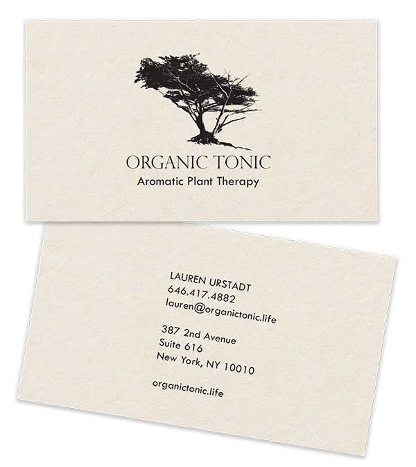
Symbolic Identity Direction: I custom-designed the central brand mark featuring a stylized cypress tree, leveraging its industry associations with resilience, grounding, and natural therapy to establish immediate consumer trust.
-
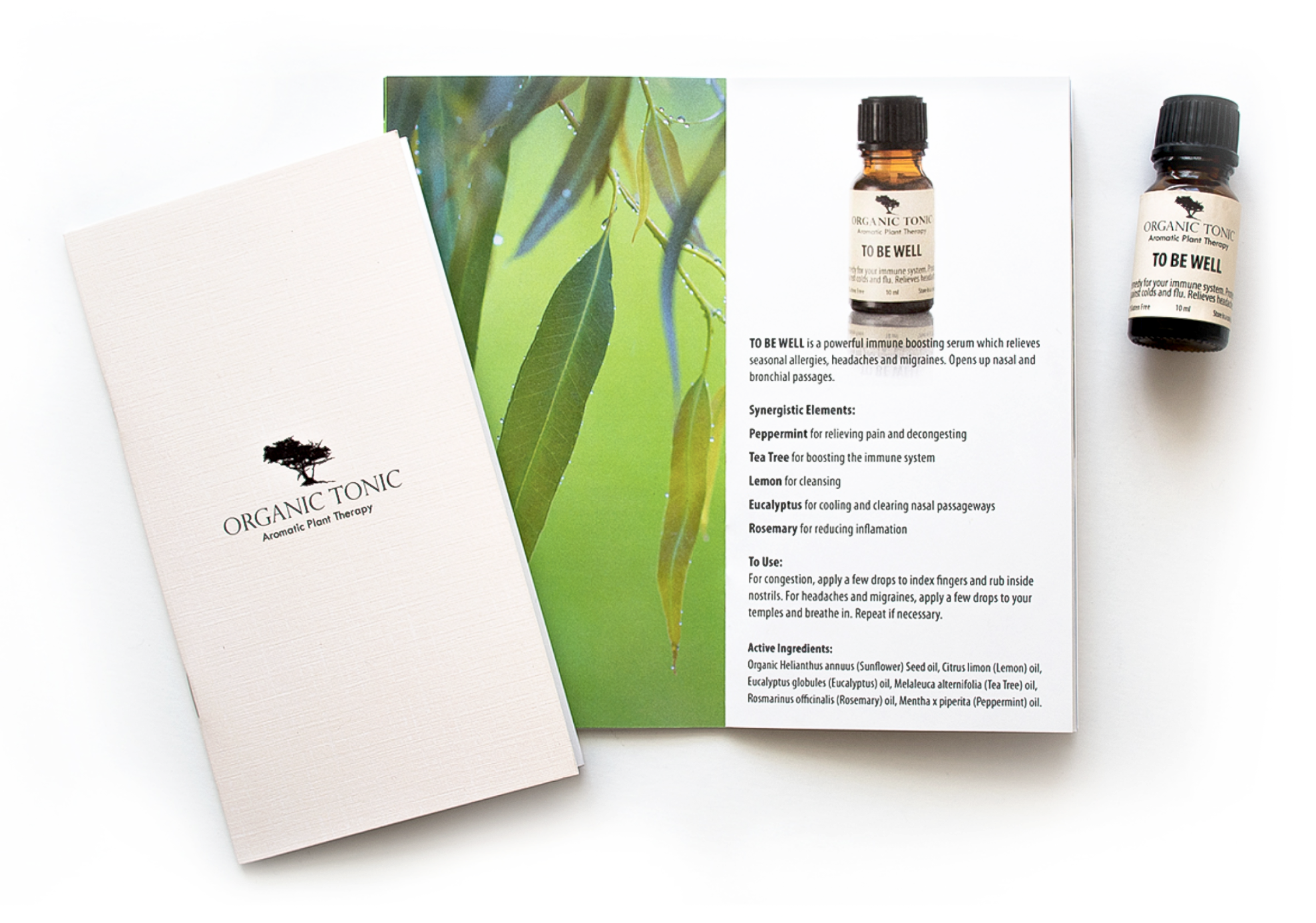
Cohesive Packaging Architecture: I curated a minimalist layout structure utilizing a neutral background palette, allowing the product names, functional benefits, and sharp typography to pop cleanly on bottle labels and retail boxes.
-
Omnichannel Brand Scaling: I engineered the visual assets to scale seamlessly across tight physical print specs—including business cards and instructional marketing brochures—while maintaining a premium, spacious layout on the web.
Result
Successfully launched a complete, retail-ready visual ecosystem that translates the sensory purity of aromatherapy into an authoritative commercial brand. The harmonious balance of organic iconography and clean packaging geometry effectively maximizes shelf presence and user engagement across all physical and digital touchpoints.




ATMOSPHERE
ARCHITECTURE FIRM
ATMOSPHERE: VISUAL IDENTITY & STATIONERY DESIGN
INTERPRETING SPATIAL GEOMETRY AND ATMOSPHERIC TRANSPARENCY
Challenge
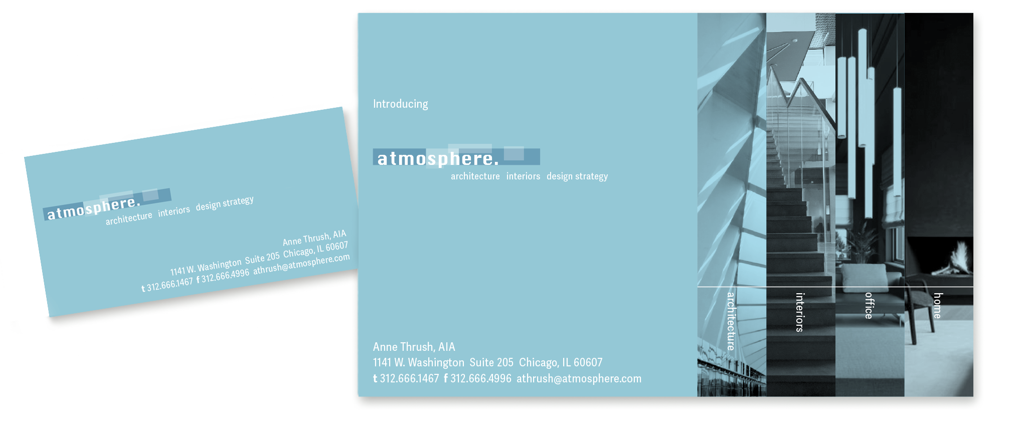
Create a cohesive visual identity, business cards, and promotional postcards for an architecture firm in Chicago, IL. The objective was to design a modern, minimalist brand system that directly echoes the structural and elemental nature of the company name while mirroring the firm’s precise design aesthetic.
Strategy
I engineered a high-concept identity system, authoring the logo mark and physical stationery layouts to serve as a literal translation of architectural form:
-
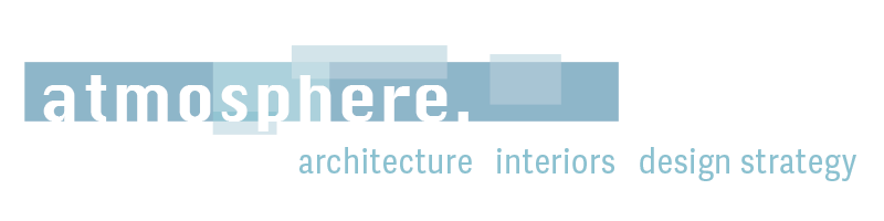
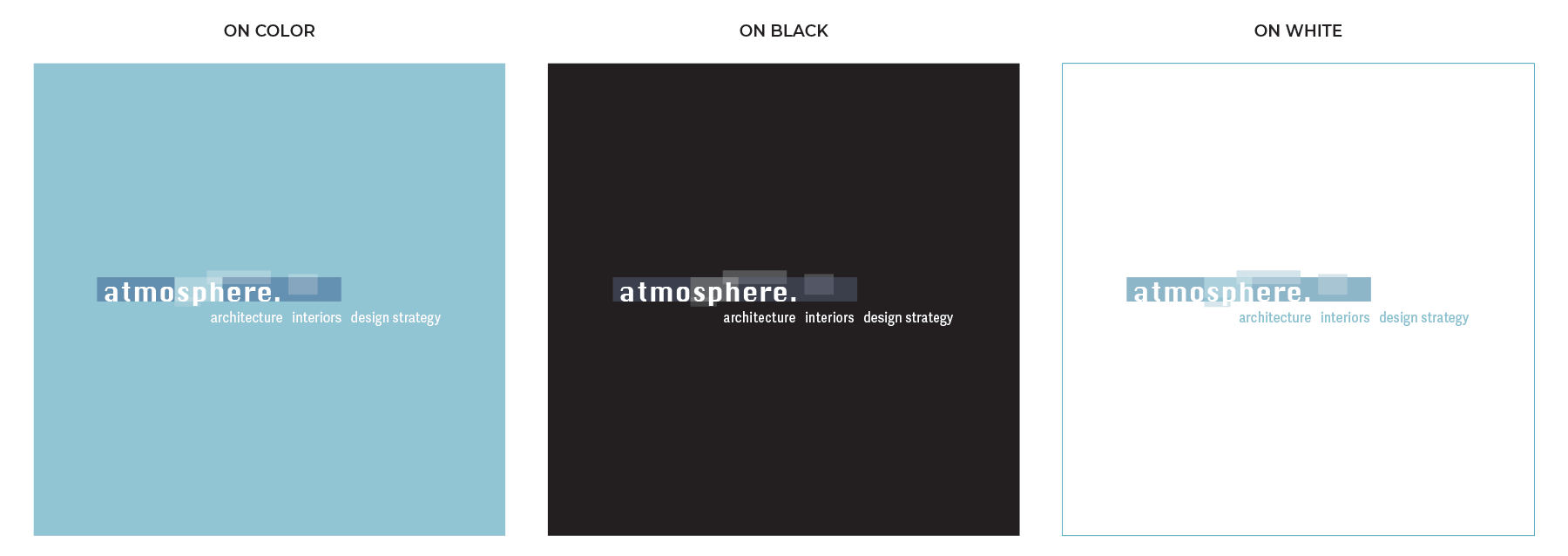
Structural Geometry Development: I utilized sharp, rectangular shapes to build out the logo architecture—symbolizing foundational building blocks, structural blueprints, and the physical mapping of interior walls.
-
Atmospheric Transparency Mechanics: To activate the brand name, I curated a targeted color palette with layered transparencies. This technique beautifully mimics structural depth and shifting atmospheric layers, giving static print assets a distinct spatial dimension.
-
Minimalist Print Curation: I executed the layout design across corporate business cards and postcards using a hyper-clean line system and spacious typographic grids, aligning the firm’s outward marketing directly with their structural precision.
Result
Successfully delivered a highly conceptual, sophisticated corporate identity that positions the architecture firm as an authority in modern design. By marrying elemental atmosphere with physical geometric building blocks, the resulting print assets function as an immediate, tactile portfolio of the brand’s structural philosophy.
SKYSCRAPER VENTURES
VENTURE CAPITAL FIRM
SKYSCRAPER VENTURES: BRAND IDENTITY & PREMIUM PRINT PRODUCTION
ENGINEERING TACTILE SYSTEM GEOMETRY ACROSS CORPORATE COLLATERAL
Challenge
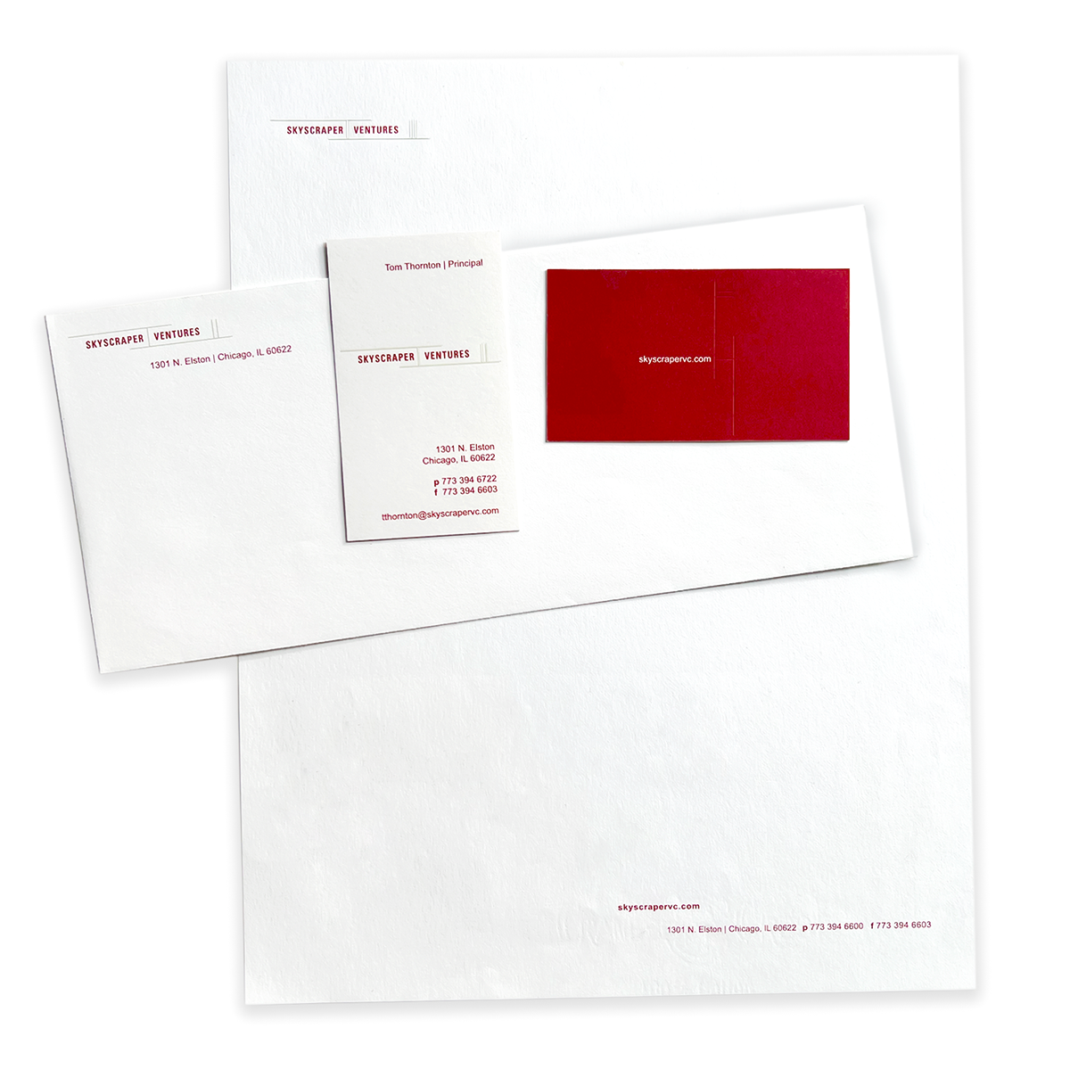
Create a sophisticated corporate identity and stationery system—including a logo, letterhead, envelopes, and business cards—for a venture capital firm. The core objective was to minimally communicate the power and stature of a skyscraper through a unique design language, translating that structural concept into a highly tactile physical print experience.
Strategy
I acted as the lead art director and graphic designer, conceptualizing a minimal, high-contrast visual system anchored in precise geometric mechanics and premium paper engineering:
-
Multi-Dimensional Print Engineering: I designed a custom business card utilizing advanced paper mechanics, where minimalist lines representing a skyscraper punch into the card stock—appearing embossed horizontally on the front and debossed vertically on the back.
-
Minimalist Identity Construction: I established a sharp, modern logo mark that balances extreme horizontal and vertical lines, capturing the sleek architectural essence of a skyscraper while maintaining the serious, high-end authority required for a venture capital firm.
-
Cohesive Stationery Architecture: I scaled the minimalist identity across the firm’s complete corporate suite, ensuring the letterhead, envelopes, and embossed business cards maintained absolute alignment in grid structure, paper texture, and type hierarchy.
Result
Successfully launched an authoritative, premium brand identity system that commands immediate commercial credibility. By prioritizing advanced print mechanics and structural minimalism over loud graphics, the final physical touchpoints serve as a direct reflection of the firm’s precision-driven investment philosophy.